The world’s leading public transport networks have for generations set the benchmark in typographic design and branding, helping to shape the identity of the cities they represent.
The most famous example is the iconic look of the London Underground, shaped by creative masterminds Frank Pick and Harry Beck; the man responsible for the most recognisable public transport map ever.
You’ll be hard-pushed to find a more elegant, yet functional, typeface than Johnston, at the heart of all London Underground signage for more than 100 years.
Not to be outdone, the New York Subway system revealed its now ubiquitous – and often imitated – Helvetica-led identity in the 1960s, created by Chicago design experts Unimark International.
Here in Birmingham we’ve never had an underground train, or connected ‘overground’ network, to inspire such transport design philosophy.
The closest we’ve come is the little WMPTE character I remember from the 1980s.
All that could change, though. For as the Midland Metro tram extends through the city centre, let’s take the opportunity to give it a new graphic identity; something chic and stylish, but also practical. Something that really sets Birmingham branding apart from other UK cities. I’m thinking less corporate, more creative.
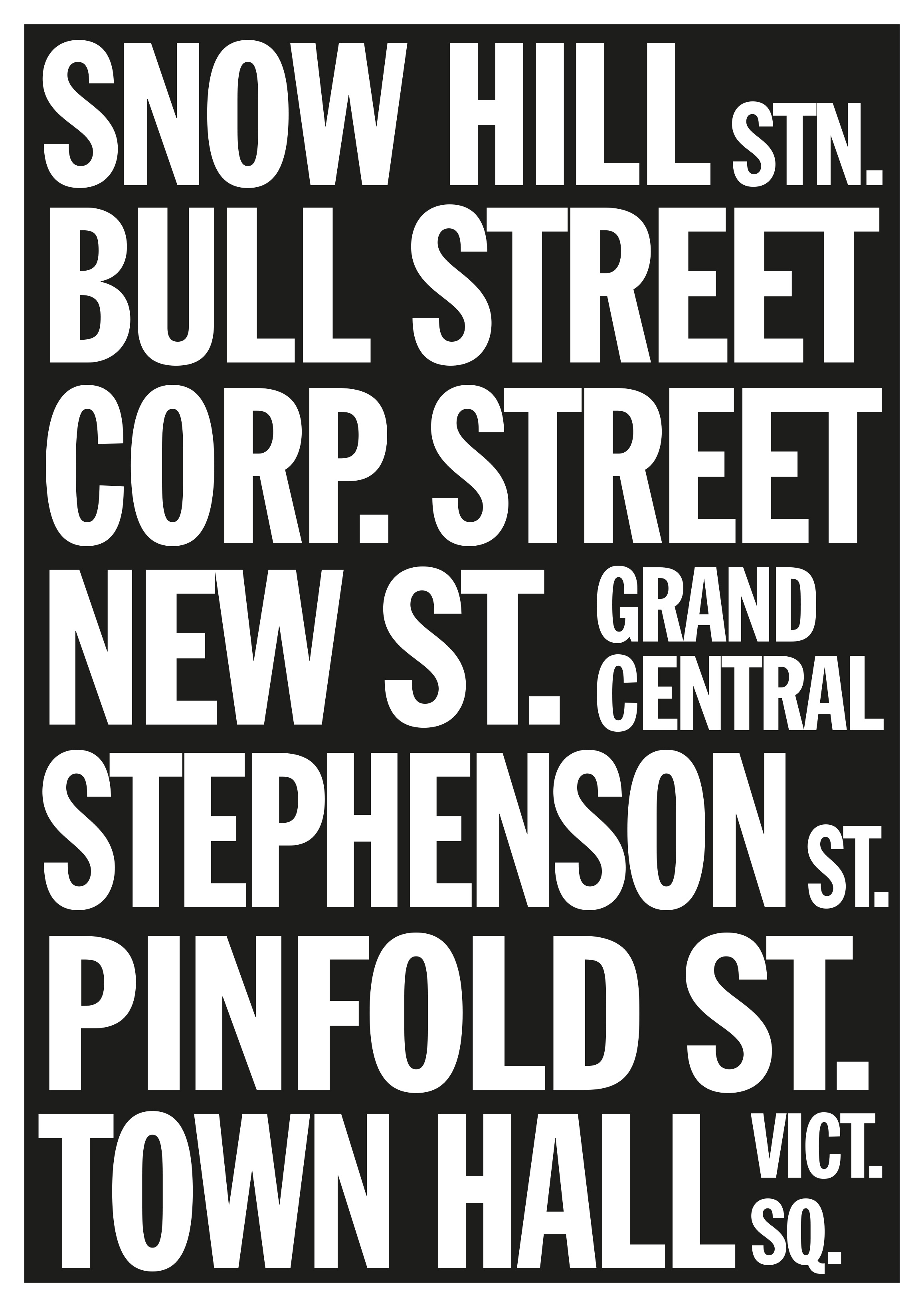
Here’s my starter for ten, inspired by pre-digital bus blinds and an unashamed homage to US East Coast cool.
It’s hardly a new brand or image, but seeing the words Grand Central in that famous Manhattan style was an opportunity too good to ignore.


